
A brand’s design can look perfect on paper and still produce screens that some of your users simply cannot read. It happened to me recently, on an interface I develop: hundreds of texts too pale against their background, including the main button label and the tab bar, across some thirty screens. No design review had caught it.
This article covers only one part of accessibility: the contrast of text and indicators. It is visible, measurable, and still surprisingly easy to miss.
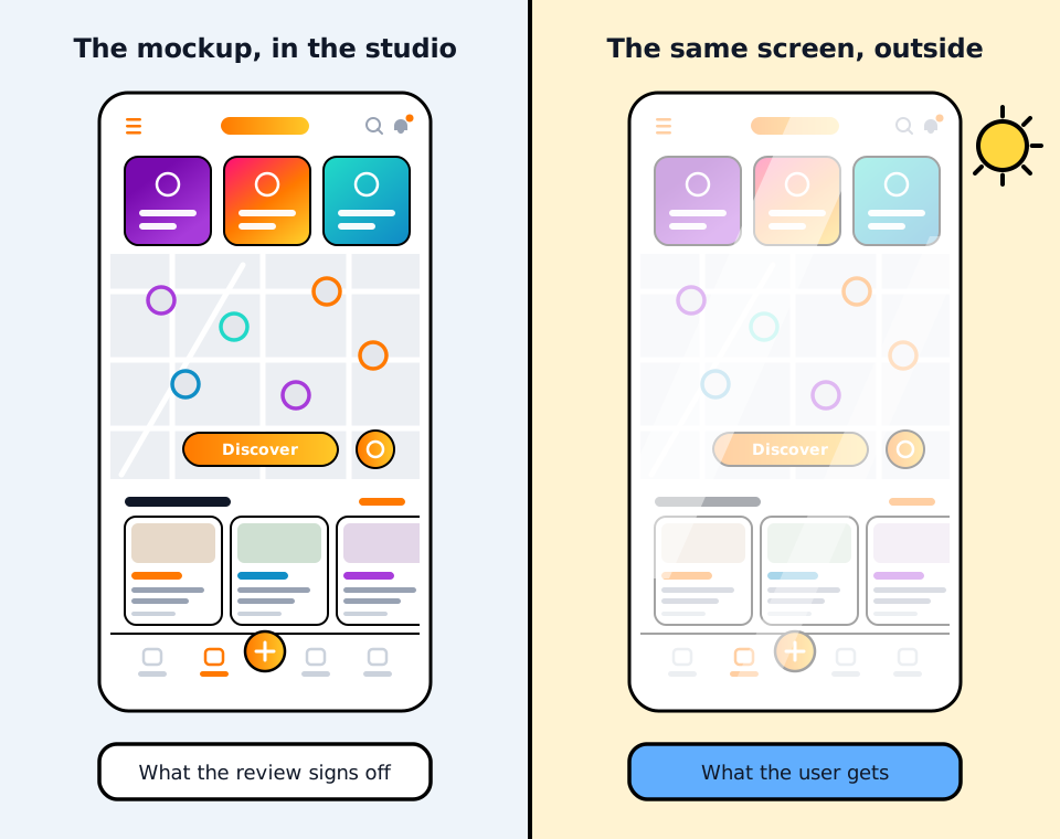
What the mockup does not show
A review looks at intent, on a nice screen, in good conditions. Real life also means the same screen in bright sunlight, on a cheap phone, or read by someone who is sixty. Light grey text on a coloured background can look “sleek” in the design file and become invisible outside.
In this interface, much of the text sits on a gradient, a translucent layer or a blend of tints. The colour to judge is the one obtained once those layers are composed, in every theme and every state, not only the value written in the file. The mockup can and should eliminate some mistakes. On its own, it cannot prove that the final implementation remains readable everywhere.
What a green score does not prove
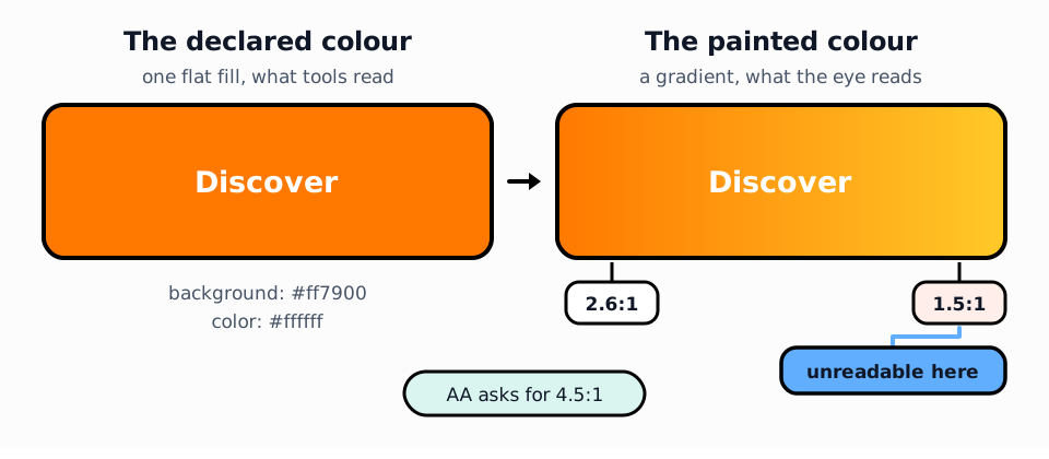
The next reflex is to run Lighthouse, get a nice green score and tick the box. But a green score does not prove that every piece of text is readable. It means the automated checks found no problem. Gradients, background images and some overlapping layers remain difficult to analyse: they need a dedicated check.
The most instructive trap came from our own check. To judge a gradient, it computed the average colour. A plate going from dark to light therefore produced a reassuring average, a colour painted nowhere on screen. The test went green on a fiction.
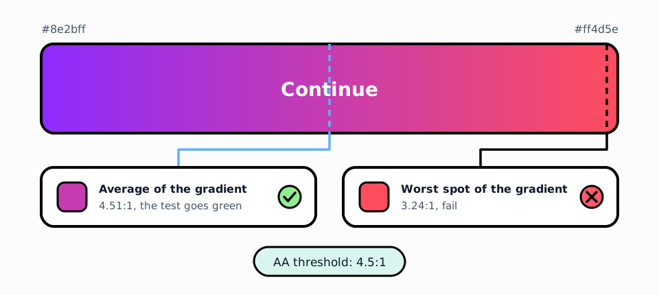
A check that shows green on a colour that does not exist sells peace of mind while guaranteeing nothing. We fixed it to judge the worst spot of the gradient, not its average.
Why it was a product problem
The worst cases landed on the button everyone taps, the navigation bar, and the little frame that shows where you are when navigating by keyboard. The elements everyone touches, barely visible to a chunk of people.
Text that is too pale is not “a bit less pretty”. It is a user who cannot find the button, who gives up, who calls support. On a consumer product, readability is a conversion number before it is a compliance checkbox.
What we fixed, and what remains
We combined the three levels that were missing: design review, automated checks and inspection of the interface actually rendered in a browser. None is enough on its own. Together, they uncover obvious mistakes, implementation mistakes and the cases automation cannot decide.
The point that matters to a decision-maker is that no brand colour moved. What changed is the ink on top. Each type of background now has its own text colour, chosen once in the design system instead of eyeballed screen by screen. We went from hundreds of insufficient cases to a handful.
That handful consists of white text on the brand gradient, where no single text colour meets the threshold across the whole surface. Knowing about them does not make them compliant. These residual issues still need fixing by changing the composition, for example with a local background or different placement, without necessarily touching the palette.
A guardrail, not an audit
The guardrail is a small test that runs in seconds on every change. It does not replace an accessibility audit, and does not even cover all of accessibility. It does one narrower, useful job. It stops a new colour, a rebuilt component or an added screen from slipping back below the bar without anyone noticing.
The useful question is not “what is our score?”
Accessibility is not a favour done for a minority. It makes the product usable by people who age, who read in the sun or who simply have average eyesight: everyone, sooner or later.
Since June 2025, the European Accessibility Act has also applied accessibility requirements to defined categories of products and services, including e-commerce, banking, transport and electronic communications. But compliance is not the best reason to care, and this contrast test is obviously not enough to establish it.
For a decision-maker, the useful questions are simpler: how many of our users can actually read our screens? What stops us from becoming unreadable again next month? If the answer is “the team’s vigilance”, there is no answer.
In this case, the first diagnostic and the guardrail took half a day. If you have a consumer product and nobody has ever checked the contrast of the interface actually shipped, we can look at it together.