
On a line-of-business app I maintain, a set of settings cards each show a small “?” badge that opens a help bubble on hover. Nothing exotic, a pattern you’ll find on half the web. Except the bubble flickered. You’d move the cursor toward the badge, the help would appear, vanish, reappear, in a nervous strobe that made the screen look broken. And it kind of was.
This sort of detail breaks no feature. You can leave it sitting there for months; nobody files a ticket for it. But that flicker is exactly the kind of thing that plants a quiet doubt in a user’s mind: “this software isn’t finished.” The perceived quality of a business tool rides on these micro-details as much as on the big features. It is the broken windows theory applied to software. A visible defect left alone signals that nobody is looking after the rest, and it ends up licensing others.
Why the bubble flickers
The naive instinct for this kind of bubble: open on the badge’s mouseenter, close on mouseleave. That works as long as the cursor stays on the badge. The trouble starts the moment there’s a gap, even a single pixel, between the badge and the bubble, which there almost always is, since the bubble shows up next to the badge, not on top of it.
When the mouse leaves the badge heading for the bubble, it crosses that void. The browser fires mouseleave on the badge → we close. The bubble disappears from under the cursor → the badge is under the mouse again → mouseenter → we reopen. mouseleave → close again. At the screen’s refresh rate, that’s a strobe light. The pointer sits on an unstable boundary, and each crossing fires a contradictory event.
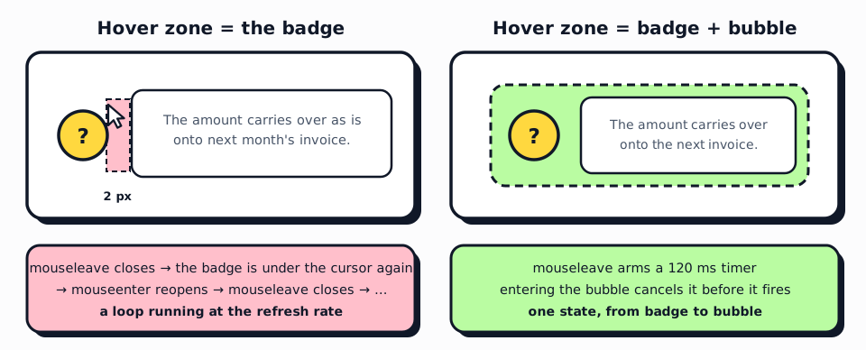
The second problem shows up when you line several cards up side by side: sweeping the mouse across the grid opened three bubbles at once, overlapping. Two distinct bugs, one root cause: we treat hover as an instantaneous binary signal, when the user’s intent has both a duration and a context.
Reading an intent rather than raw events
The right abstraction is called hover intent. Instead of reacting to each isolated mouseenter/mouseleave, you read an intent: “the user wants to read this help” (they linger), “they’re done” (they leave for good).
A grace delay on close. On mouseleave, don’t close immediately, arm a ~120 ms timer. If the cursor reaches the bubble within that window, cancel the timer. The little gap between badge and bubble becomes crossable.
The bubble is part of the hot zone. mouseenter on the bubble itself cancels any pending close; its mouseleave re-arms the timer. Badge and bubble form one logical zone, even though they’re visually separate.
One bubble open at a time. Before opening, close whichever one is lingering. A simple module-level registry is enough, no state manager required for this.
Here’s the whole thing as a dependency-free Stimulus controller:
import { Controller } from "@hotwired/stimulus"

// Shared registry: only one bubble open at a time.
let openController = null

export default class extends Controller {
  static targets = ["content"]

  connect() {
    // Touch screens have no hover: fall back to tap.
    this.hoverable = window.matchMedia("(hover: hover)").matches
    this.closeTimer = null
  }

  open() {
    if (!this.hoverable) return
    clearTimeout(this.closeTimer)
    if (openController && openController !== this) openController.hide()
    this.contentTarget.hidden = false
    openController = this
  }

  scheduleClose() {
    if (!this.hoverable) return
    this.closeTimer = setTimeout(() => this.hide(), 120)
  }

  cancelClose() {
    clearTimeout(this.closeTimer)
  }

  hide() {
    this.contentTarget.hidden = true
    if (openController === this) openController = null
  }
}
And the HTML, where both the badge and the bubble are wired to the same actions:
<div data-controller="popover">
  <button type="button"
          data-action="mouseenter->popover#open mouseleave->popover#scheduleClose
                       focus->popover#open blur->popover#hide"
          aria-describedby="help-<%= card.id %>">?</button>

  <div id="help-<%= card.id %>" role="tooltip" hidden
       data-popover-target="content"
       data-action="mouseenter->popover#cancelClose mouseleave->popover#scheduleClose">
    <%= card.help_text %>
  </div>
</div>
The cancelClose on the bubble is the keystone: it’s what makes the gap between badge and bubble crossable. Take it out and the grace delay only postpones the flicker.
Two details that make the difference
Touch has no hover. On a phone or tablet, mouseenter fires on the first tap and never leaves until you touch elsewhere, and the bubble stays stuck. The matchMedia("(hover: hover)") guard neutralizes the hover logic on those devices; there, a plain tap that toggles the display is more honest. Testing a hover interaction only with a mouse is a classic trap: it works perfectly on the developer’s machine and breaks in the field, where many business users are on a tablet or a phone.
Keyboard and screen readers. I wired focus/blur alongside hover, and tied the badge to its bubble with aria-describedby. Contextual help that only exists on hover doesn’t exist for anyone navigating by keyboard. That took very little code, and it avoids quietly excluding a chunk of your users.
What I take away
The fix comes down to three ideas (grace delay, hot zone extended to the bubble, one open at a time) and about thirty lines. No library, no heavy component. What took effort was seeing the problem and refusing to let it slide.
A business tool is judged in use, across the thousand micro-frictions of daily work, rather than during the demo. Absorbing those frictions on the vendor’s side is invisible work: it shows up in no spec sheet, and users only notice it in the negative, the day the tool stops getting in their way.
If you have an internal tool that “works” but that your teams find vaguely annoying without being able to say why, it’s often an accumulation of details like this one. We can look together at which ones are actually worth fixing.